UX/UI Case Study: Equifax Fit2Work
Overview
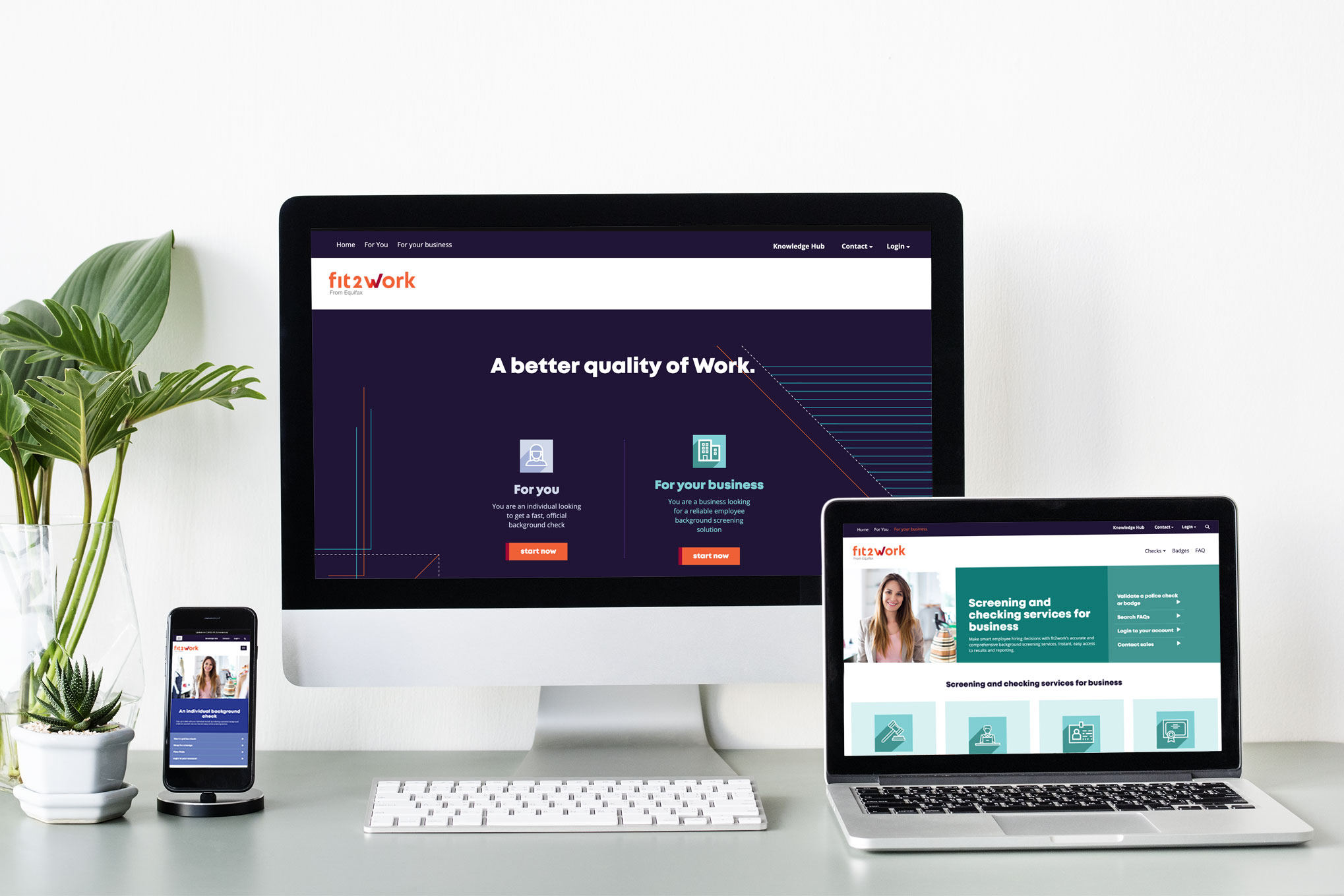
This project was a new end-to-end website build. Equifax was looking to build a website for their newly revamped Fit2Work product.
Role
Research, Ideation, Prototyping, Visuals
Timeline
6 weeksType
Responsive Website Design
Tools Used
Miro, Balsamique, Photoshop, Illustrator, InVision
The Problem
In this day and age, security is at the forefront of everything. Especially when hiring new staff, it is often necessary to run a variety of checks on the future employees. Individual are also often required to provide proof of identity and security checks for a number of reasons. Equifax has created a product to allow quick and easy checks for all users.
The challenge for this project was building a website that is an entrance point for the main user journey and would give all the information required for the users to understand the product, to help them choose the right check and to navigate them to the portals to do the actual check.
The Solution
Build a sleek, easy to navigate website that caters to all different users. Allow them to find information quickly by creating a smooth user journey.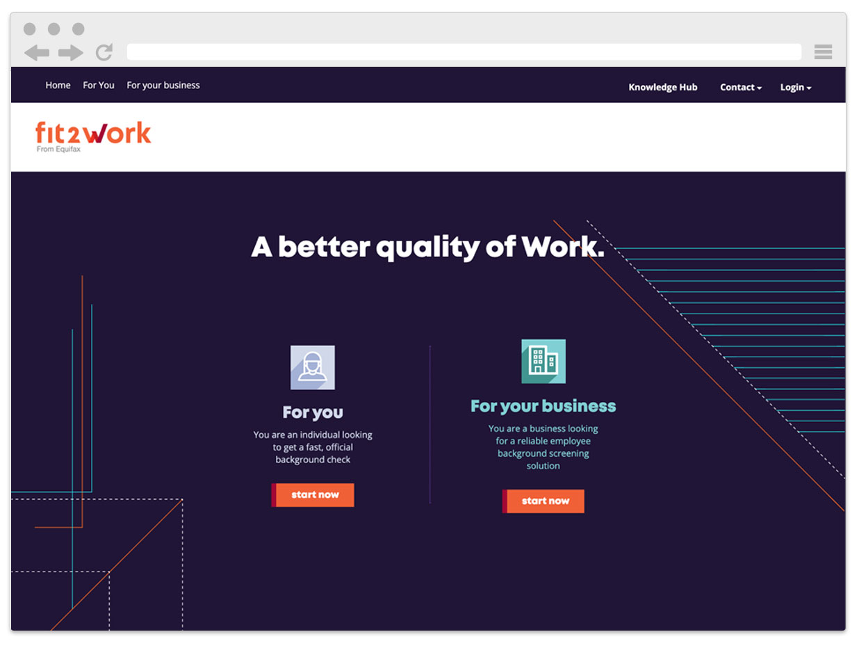
Discovery
I started the project with the discovery process to fully understand the scope and problem that we were trying to solve. The new website was also loosely based on two other already existing websites. So I did a deep dive into these to fully understand existing user journeys, offerings and also existing problems. I utilised whiteboard discovery sessions as tool with the stakeholders.
Define
In this phase included reviewing and validating our existing personas and creating journey maps.
Personas
We already had existing personas for this product. However, I did organise a session with the stakeholders to validate those personas and ensure that they are still up-to-date.
Journey Maps
Once the personas were validate I started by drawing out the different journey maps based on each different persona and their needs. From that process it became quite clear that we had two main streams. Business owners and indivudals, so I decided to split the path from the beginning and have separate areas for those two main groups.
Ideation
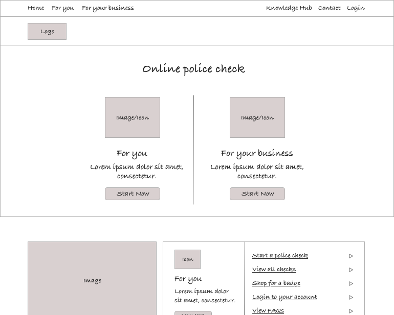
The next step was to work out the main Information Architecture(IA) of the website. I decided to organise two more workshops with the stakeholders. In session one, I lead the stakeholders through a card sorting exercise, where I asked them to categorize and sort topics into sections that could be used to create the IA. From that I could come up with a tentative IA that I presented in the second session. We used the second session to finalise the IA.
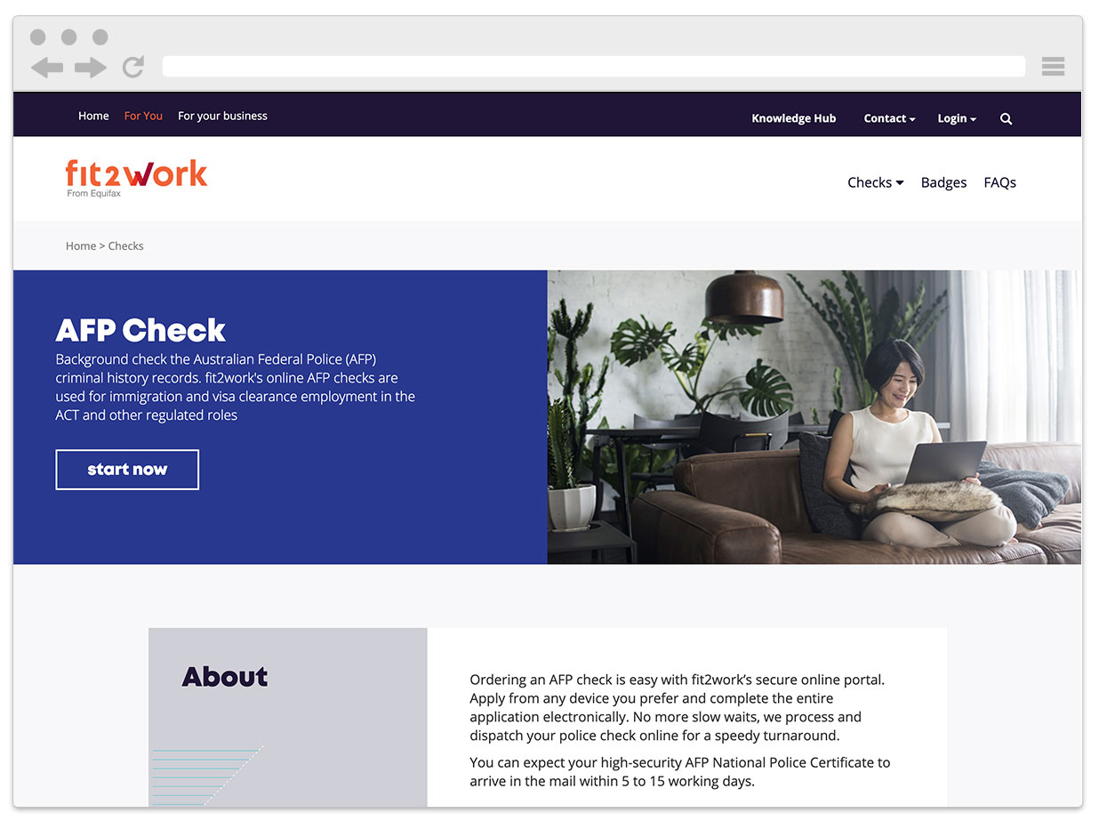
I could then move to creating wireframes of the first main pages. As the website was build in a CMS our goal was to build out a number of templates that can be used. Which meant I didn’t have to build out every single page. Based on the user journeys, I build out some of the main pages in wireframe format. Using those wireframes I was able to build a simple prototype which I could use to test whether the ideas would work and that the wireframes work well for our user journeys.
Design & Testing
Once the wireframes were signed off, I was able to start on the high fidelity screens. An agency had provided us with the new logo and an overall style guide (print & brand) for the product. I utilised this to create a digital style guide that could be used for the website. Similar to the wireframe stage, I created a prototype in InVision to allow stakeholders to experience the designs in a more realistic scenario and to validate the user flow. As part of this process, I also defined the user interaction for links, buttons etc.
Using the prototype, I ran workshops with stakeholders presenting the screens and user flow. I collected feedback that could be used to make iterations to the design. Because we went through quite a lot of iterations in the ideation state, this process went pretty smoothly and not too many changes had to be made.

Handover to developer
The last step was to create specifications and hand-over notes for the developer. I create technical specifications and requirements that detailed the interaction attributes and functions. I also provided final artwork, so the developer could use to export elements and use it as reference.
Outcome and learnings
The project was delivered on time and with stakeholders very happy with the new website. I delivered some clear user journeys and users can reach most actions in just a few clicks.
I learned a lot about stakeholder management. The project had many people, with very different backgrounds and points of view, involved. I learned to successfully navigate this by taking the stakeholders on the journey, educating them and finding different ways of communicating with each and every one.